Introduction
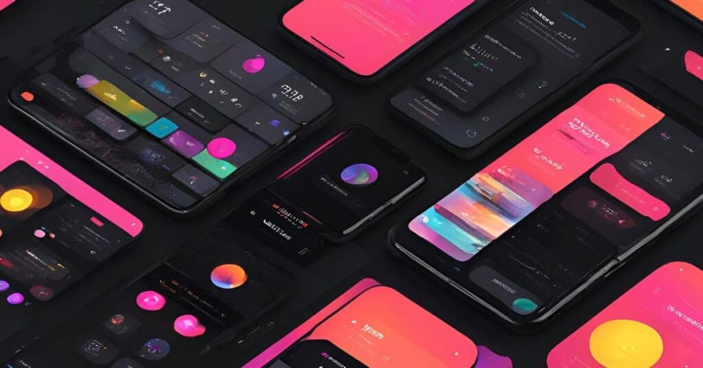
Dark mode has become a popular design trend, with many users preferring it for its aesthetic appeal and reduced strain on the eyes. Major platforms like iOS, Android and popular apps have adopted dark mode, making it essential for designers to understand how to create visually appealing and functional dark-mode designs.
This blog explores the best practices and tips for designing user interfaces optimised for dark mode.
Why Dark Mode?
1. Improved User Experience: Reduces eye strain in low-light environments.
2. Battery Efficiency: Extends battery life on OLED and AMOLED screens.
3. Visual Appeal: Provides a sleek, modern look.
4. Accessibility: Offers an alternative for users sensitive to bright light.
Best Practices for Designing Dark Mode
1. Use True Blacks and Dark Grays Strategically
– Avoid pure black (#000000) for large areas; instead, use dark grays (#121212) to prevent excessive contrast.
– Use true black for OLED screens to save battery life sparingly.
2. Maintain Sufficient Contrast
– Ensure text and icons are easily readable against the dark background.
– Follow accessibility guidelines (e.g., WCAG) to achieve a contrast ratio of at least 4.5:1 for text.
3. Adjust Colors for Dark Mode
– Desaturate colors slightly to avoid them appearing overly vibrant.
– Test primary and secondary colors on dark backgrounds for visibility.
4. Incorporate Subtle Shadows and Highlights
– Use soft shadows and highlights to create depth and prevent flat designs.
– Avoid harsh outlines and ensure elements are distinguishable.
Common Mistakes to Avoid
1. Over-saturating Colors: Vibrant colors can strain the eyes.
2. Low Contrast: Leads to readability issues.
3. Ignoring User Preferences: Always provide a toggle option.
4. Inconsistent Design Elements: Test across all screens and components.
Tools for Designing Dark Mode
Figma: Dark mode plugins.
Adobe XD: Preview designs in dark mode.
Contrast Checkers: Ensure accessibility compliance.
Browser DevTools: Test web designs in dark mode.
SEO Guidelines
- Keyword Research:
- Primary Keyword: “Designing for Dark Mode”
- Secondary Keywords: “Dark mode design tips,” “UI design for dark mode,” “best practices for dark mode.”
- Meta Description:
- “Learn the best practices and tips for designing dark mode interfaces that enhance user experience and improve accessibility.”
- Headings:
- Use H1 for the title, H2 for main sections, and H3 for subsections.
Conclusion
Dark mode is more than just a trend; it is a necessity for creating user-friendly, visually appealing, and accessible designs. By following the best practices and tips outlined in this blog, designers can ensure their dark mode interfaces are both functional and aesthetically pleasing.
Embrace the dark side of design to deliver an exceptional user experience!